A lot of designers will say that newspaper portal websites cannot have a good design as there is so much content to show that it cannot possibly work.
Never listen to this, because while it is hard to design a good news portal that is constantly being updated, it is certainly not impossible.
We will teach you about the trends in the industry and what to watch out for if you plan on designing one. Also we will give you a showcase of 10 great newspaper website designs that you must see!

Newspaper Website Designs And Their Key Factors
- The Color Scheme is crucial, yet pretty generic and plain. You will always see the same design concept when it comes to this very important elements. White, black, silver, gray, blue and perhaps some green. The background is usually light with the content in dark black font with clearly visible blue hyperlinks. This isn’t always the most aesthetic thing to look at, but it clearly the best option for presenting content to the readers.

- Revenue is generated though advertising that tends to be annoying. They need to make money too right? It’s only fair that they display those ads considering how much information they provide us for free. But these ads tend to really mess up the look of the website which is what most designers don’t keep in mind. You can see the banner ads in the header or right sidebar of the website usually.
- Navigation is always at the top. This is because there there is a lot of content in many different categories and the best way to present them is in the top menu. Some sites combine both top and left sidebar navigation at the same time since they run out of space.
- RSS Feed and Social Media bring in many visitors. Encouraging viewers to share and engage in the content is crucial to the success of news portal, until the users begin doing it on their own.
Top 10 Newspaper Website Designs
Now it’s time to present the showcase of the best designs.
1. The Onion – The Funniest Grid Ever
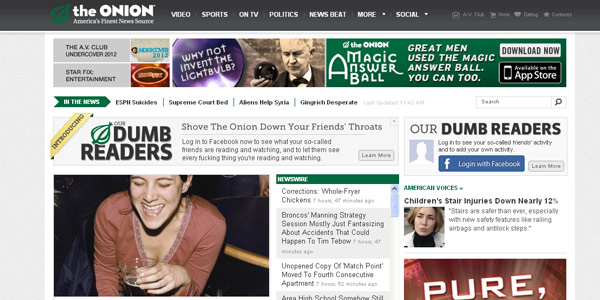 The Onion, is a satirical website of news that can make us laugh pretty good! That’s why their content is shared so much and social media integration is very important to them. This website has a great design and even the ads are chosen so they don’t interrupt the general theme so much.
2. USA Today
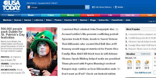 The design team wasn’t afraid to experiment a bit with the design of the USA Today. A bit of vividness can be seen in the color scheme that works great for this site!
3. The Telegraph
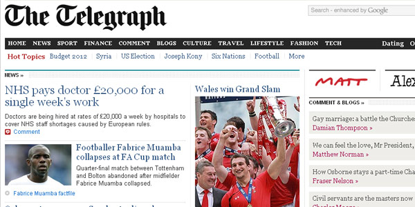 A leading newspaper in the UK with a great web presentation. Lovely work, except for the banner adds that are too random and surly not in the design of the site as a whole.
4. The Times
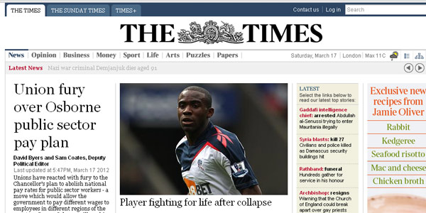 Clean newspaper website designs got their trends from here. The best thing about The Times is the way they handled navigation. It isn’t too bulky and doesn’t take too much space in the header.
5. ABCNews
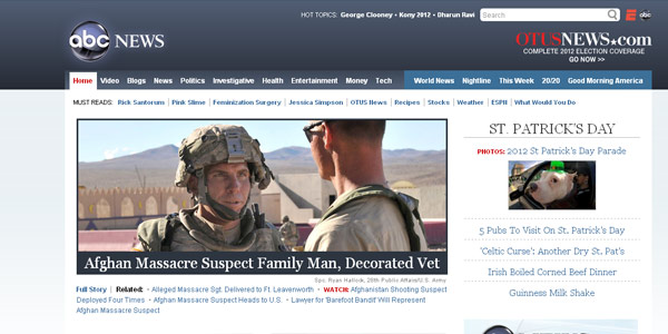 A little bit experimental and different from the other sites in the showcase. The design is really nice until you start scrolling down. Then it becomes really crowded and plain.
6. MSNBC
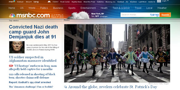 Quite unorthodox and really a pleasure to look at. It is easy to navigate and is certainly one of the best newspaper websites online at the moment. Make sure you check it out!
7. Mail Online
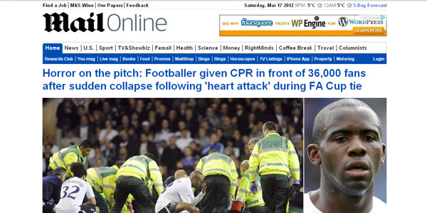 A pretty standard presentation and there isn’t much too learn from this web design. However, there is one important thing and that is the featured news they have with larger, dynamic pictures that they use that should get you thinking. It is quite an effective tactic.
8. Houston Chronicle
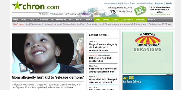 Their beautiful, modern logo is the jewel in the crown of the design of their website. The green is very dominant which steps out from cliche that dominated the industry.
9. The Tennessean
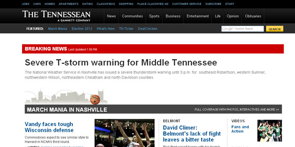 Great looking and clean website and very modern. The way they highlight the features/ breaking news with the use of red to brake the monotony of the theme is really nice.
10. The Los Angles Times
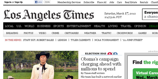 When it comes to newspaper website designs, the LA Times ranks pretty high and reflects a great execution of of various trends throughout the site.
One should be inspired by this design, but stay away from copying it or you will end up having your design look like thousands of other websites on the Internet!
It’s the Houston Chronicle, not Chronicles.
Thanks Michael. Updated accordingly.
Quite interesting that all of the top ten newspaper designs are American or British. And they rather look the same too, in terms of navigation and departements…
Hi Erik. I agree they all do follow some consistent design patterns and layouts. However, after working with a few of the big names, I can tell you they’ve spent millions in researching user interactivity and click-through so when designing a newspaper or magazine, I’d trust their research.
Its an Interesting post and I’ve updated my skills according to the latest trend. The various points highlighted are totally fresh for me. Thanks for sharing.
I’d like to put forward “http://www.nzherald.co.nz/”; looks stunning on tablets.
Thanks Tom for the submission. It is definitely a clean site they have at NZHerald.
i like all that
I Also agree that they all follow some consistent design patterns and layouts. Also, If you can tell they’ve spent millions in researching user interactivity and click-through so when designing a newspaper or magazine, then we can trust their research. Adeile from Caleb University Lagos Nigeria.